Asante Health System is a group of hospitals and other ancillary healthcare providers. They approached the agency I worked for—Lanphier Associates, Inc.—wanting to refresh their brand and visual identity system. This project was to also coincide with the opening of their new modern patient care tower. I provided a significant amount of art direction and production for this project.
The client, being the largest healthcare provider in the region, wanted to be represented both as technologically advanced, and having a rich history of excellent care. The term "retro-modern"—coined by our client—became our litmus as we explored different colors, fonts and shapes for the logo mark itself.
We ended up with a mark that was decidedly more symmetrical and precise. The container was shaped like a keystone to symbolize our client's critical role in the region, while the head of the figure was kept at a slight turn to maintain a certain amount of friendliness, and approachability.
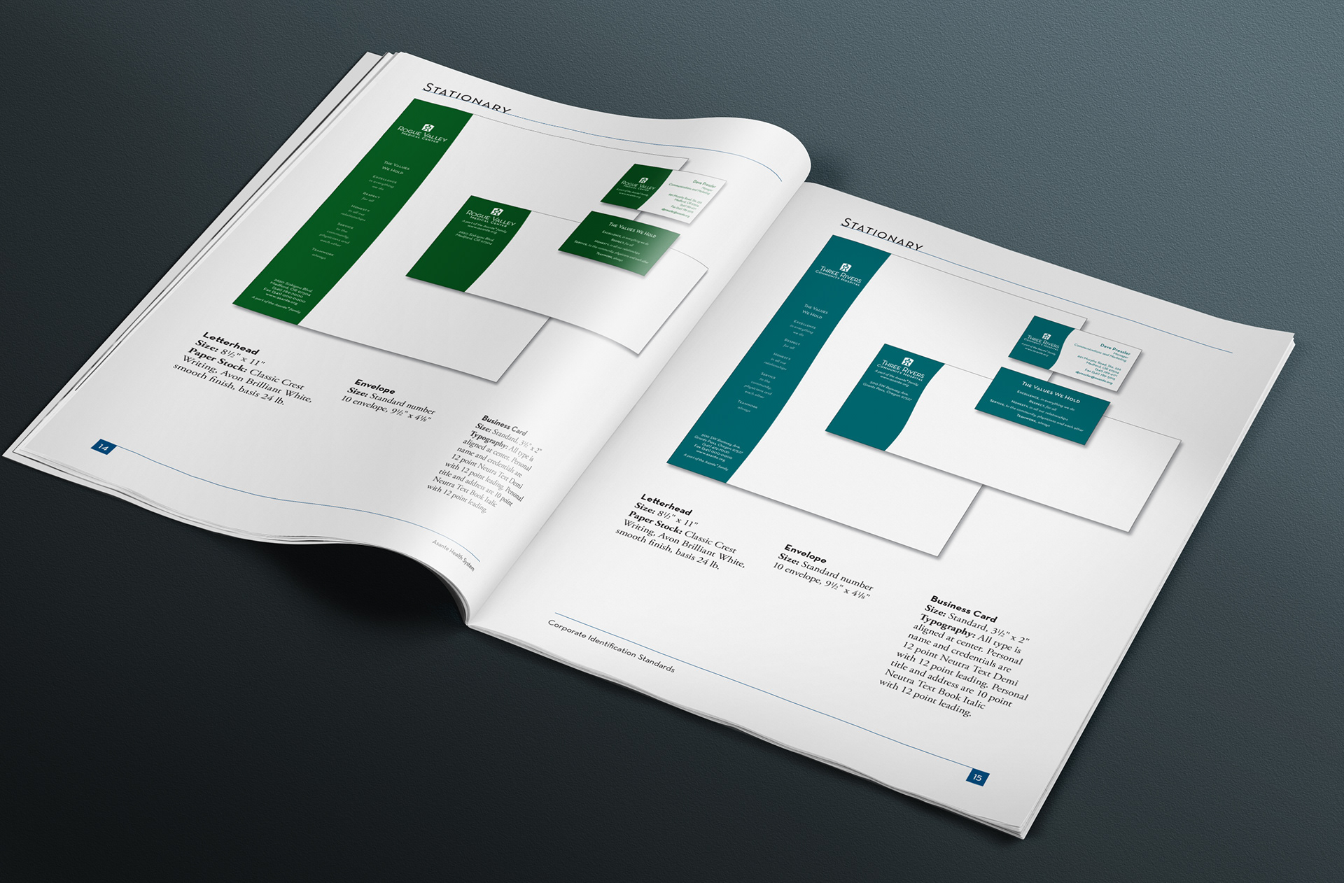
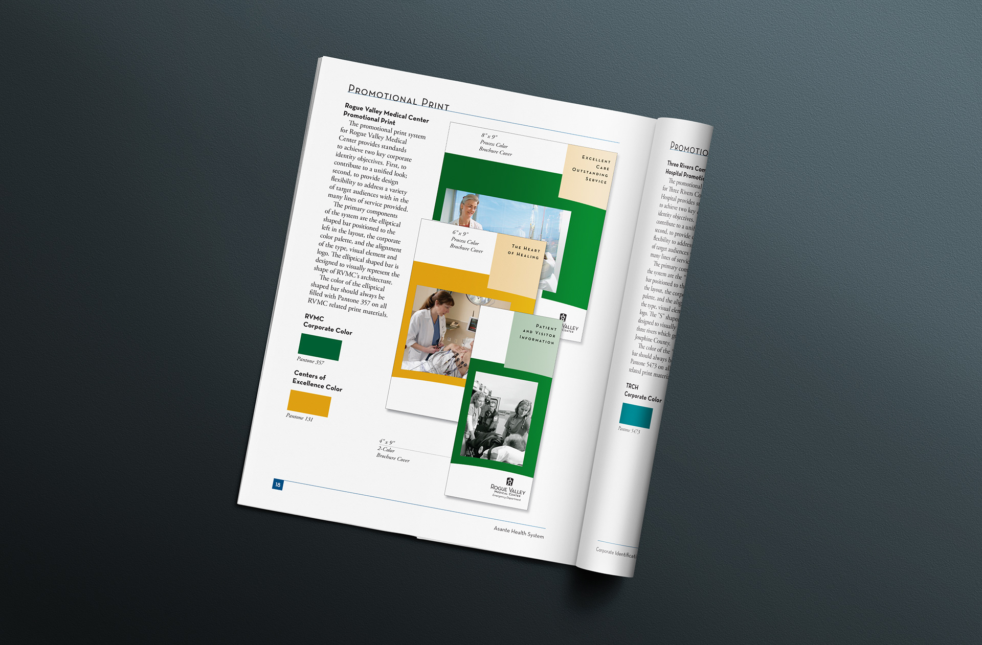
We also developed an extensive graphic style guide (pictured below) to govern the use of their marketing and communications visuals—from marketing collateral to advertising.